Wednesday, 30 November 2016

Collage Session and Circus


This was the first Visual Language workshop brief that I have really got intend enjoyed. I love using collage as a medium and having used it a lot last year it was really nice to come back to.

What went well?
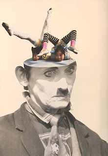
  • I think that using a repeat motif worked well because it created a sort of narrative, which runs through the whole book. 
  • I also think that working really simply, each time just making a tiny change to my image worked really well rather than filling my pages with lots of interacting forms. This is because it created a focus to my book and showed how easy it can be to create simple and effective illusions with collage. 
  • I also think that using a black and white motif worked well because it allowed me to animate it with a bit of colour if I chose as wall as casting the focus onto the alteration rather than the man himself.

What challenges did I face?
  • I enjoyed using the same repeated motif for the first two pages, after which I found it quite limiting. I kept coming up with cool ideas for interesting landscapes and things that I could do with the whole figure (which couldn’t be applied to my man). However, I think that keeping with my motif really forced me to push my ideas and to do things that I wouldn’t have done had I had the freedom to do whatever I wanted. I.e. ripping up the face (which turned out to be one of my most interesting ideas).
  • I also found that even though my collages were so simple, it was a very time consuming media to work with. I also tend to work things out while I draw rather than before. However, with collage I found that you can’t do this. You need an idea of what you want to achieve or test out before you start working. I struggled with this at the start but towards the end of my book I found that it started to work well for me. 

What could I have done differently and how am I going to move forward?
  • I think that maybe I could have been more experimental in the way that I worked rather than so neat and precise. However, I personally was really drawn to the simplicity of my more graphic pieces. 
  • Even though the man that I used on my motif is from the circus, I don’t think that there is a very circusy feel to my book. I think that maybe I could have worked harder to bring in this element.
  • Having enjoyed this workshop so much I want to start bringing elements of collage into my Visual Narratives module. It could be interesting to have small elements of collage in my illustrations for my book (particularly as it is a project based on documenting and recording real world events).

Sunday, 27 November 2016

One Week Map: Screen-printing our Map


What went well?

  • I am really happy with how the screens exposed. all of the detail came out perfectly. The only thing that I would have liked was if the pomegranate had more of a texture to it.


  • I am really happy with how the design printed. Something that surprised me was that I almost preferred the design when the screens were't lined up, even though they weren't designed like this. I think that this is because the design is so simple and so not lining up adds an interesting level of ambiguity to the design.


  • I also think that the red and blue work really well together. They really animate the design and as well as making it look sleek. I definitely think that these colours work way better than when we were more experimental with colour (looks too complex). However, painting the screen does create an interesting effect.


What challenges did we face?

  • We found that we were really pushed for time when we were printing. This meant that we didn't have time to print a perfectly aligned design if we wanted time to experiment with colour. This was a shame as we designed our positives to match up perfectly. (Maybe this was a mistake as this was more of an experimental printing project?)


  • We also found that we spent a lot of time sitting around because the two group members printing the red screen were a lot slower than us. This meant that we didn't get a chance to print on top of one of the red designs. Trying to line up the designs would have been a good learning curb and it would have been interesting to see if it made a difference printing the blue on red rather than the red on blue. 


  • I also found flushing back the ink, while holding the screen away from the table really difficult. If you didn't do it totally evenly then the next two or three deigns would print badly. 


How am I going to move forward?

  • Having learnt how to screen print I definitely want to use it again in my own practice. I love the slick very finished looking results that it gives and the way it really allows you to experiment with colour (and composition to an extent) because it is such a quick process. I also think that it will work well to help me simplify my work. I definitely want to do this soon before I forget everything that we learnt in the induction.

One Week Map: Creating Our Map Screens


What challenges did we face?

  • We really struggled to agree on a general idea or theme as we all had such different ideas. All that we could decide on was that we wanted to play around with some of the different shapes that we saw on the journey in addition to texture. As a result, we all did our own separate drawings which we were going to cut up and put together. However, everyone drew quite figurative things, causing us to move away from our original plan. I think that having a theme would have tied our piece together better and it ould have meant that we wasted less time initially unsure of what we were doing.

  • Another challenge that we faced was trying to incorporate the map into our design when the drawings already stretched across both layers. We tried to form our map out of images (cutting off some so that they only filled the outside and others so that they only filled the inside). However, this looked messy and visually confusing. We resolved this by placing our images only around the map. This worked well but still wasn’t totally clear, so we just put in outlines between the objects which worked really well (an outline all the way around would have been too imposing).

  • We also struggled to draw solid forms onto the acetate. Most of the markers we tried smudged, so we had to use a permanent marker but you could see through it when we held the acetate up to the light. We therefore that knew it wouldn’t develop properly. The only way we found of creating solid shapes was to paint directly onto the acetate with acrylic paint. However, this was difficult to do on the more detailed areas.

What went well?

  • I think that our choice of colour is really nice (the only thing that we could agree on as a group). We used red and blue, two quite naive primary colours used to reflect the playground that my group spent lots of time drawing. The cold blue also reflects the miserable weather that day.

  • We also found that a chinagraph pencil drew really well onto the acetate, creating a really interesting texture. I am excited to see how this comes out when we print the design. 

  • Having struggled to work collaboratively at the start I think that we really came together and worked well as a group when transferring our design onto the acetate. Assigning everyone a different role work really well as it meant that we weren’t working on top of one another. One person continued to draw new objects to fill the gaps, while another person traced the outlines of the objects onto the acetate, then the third group member filled them in with different textures and the fourth then proceeded to paint in the most solid areas.

How are we going to move forward?

  • I am really happy with our positives and I think that they are going to print really well. The only thing I think that we should do is maybe add another layer of pen to the pomegranate. This will hopefully mean that it retains its texture, while making it print more solidly. We could also maybe altar the exposure time to accommodate for the greyer areas of our positives?

  • If We were to do this again, we would have definitely thought of a theme/ concept before starting to draw, rather than wasting time making it up as we went along.


Monday, 21 November 2016

One Week Map: Documenting my (non existent) Journey

Trying to do my journey drawings today was a real struggle as I missed the journey. I did spend about half an hour wondering around the market looking for my group earlier, so I got a sense of the place where they took their journey (they went here and in the library) but I didn’t get to do any drawing. I wanted to create a sense of my day and the horrible rainy weather, but this was a struggle without any reference. I was going to document my journey home, but i didn't feel well enough to face the rain again so I tried to do some of the tasks listed on the powerpoint at home, like only drawing things that are blue. However, all of the objects in my kitchen were quite boring and doing it at home maybe defeats the point of the exercise. I think that what I need to do now is to just do some drawings from the photos that my team mates took in the hope that I will have enough to work from tomorrow.

I am still feeling really ill and groggy and I am worried about having missed the last week of class. I am so behind and all I want to do is power through my work to get back on my feet again but its impossible when I’m feeling so crap. WHY AM I STILL ILL?!

Wednesday, 16 November 2016

Mark Making Circus Drawing

I really struggled with the mark making brief. I found creating images out of line and shape fairly comprehendible but I didn’t know where to start with mark making. Would I fill in shapes with marks or draw simply with marks?


Here I attempted to create a full page circus scene. I really like the composition of the image and think that it would have worked really well as a simple line drawing with a small amount of tone. However, it did’t really fit the brief. The use of mark making to create a sense of texture and tone overwhelmed the complex image. It is too busy and it is unclear hat is going on. Using texture definitely works better on more simplistic illustration to complement shape and create a sense of the artist’s hand.
 

I really liked the hand made quality that using mark making gave the work of some of my peers. I don’t think that I achieved this is my own work. I think that the edges of the cut out shapes look too hard and mechanical (the textures almost look digitally overlaid). Now that I have reflected on my own work and understand the brief better, I want to go back and do some more drawings. 


Laura Carlin is an illustrator who focuses on mark making in a lot of her images. Rather than using mechanical mark making and making the marks herself, she allows the media to take over. Here, instead of flatly filling in her shapes, she really embraces the surface of the watercolour. This helps to animate and lift the simple shapes of the people, while adding another level of visual interest to the image.

Sunday, 13 November 2016

End of Module Evaluation


Judge a Book by its Cover: Final Outcome


What went well?

  • I think that paper cut was the perfect media to communicate my concept. I love its slick and refined look. It allowed me to add that extra level of detail, unachievable with butterfly printing.
  • I think that using different textures works really well to just give quite a flat image a lift and extra level of interest.
  • I think that the use of different shades of one colour works well to give the book cover a simplicity. The use of a pinky red also works well with the imagery.


What challenges did I face?

  • I really struggled using the multiply setting (to achieve the different shades of one colour). It was a challenge trying to make different objects the same colour and it kept trying to erase all of my multiplied layers whenever I put it into the CMYK format to see how the colours would print. This meant that I had to print it many times because the colours printed completely differently to how they looked on screen.
  • I found choosing fonts and placing text extremely challenging. I thought that it would be the easiest thing but I found that I don't really have an eye for it. I think that this is because its something I've never really noticed or done before.

What could I have done differently?

  • I would have spent more time trying to get the colours right (they aren't quite how I wanted them in the printed cover but I ran out of printer credit).
  • I definitely could have put more time into communicating that the diseased side of the brain is the more creative one. It is more coloured than the other side but it would have worked better to put it in a bright colour (and perhaps the un-diseased side in a neutral one?)
  • I would have also spent more time on the paper cutout. I could have tried cutting out both sides differently rather than making it symmetrical (the brain isn't symmetrical).

Judge a Book by its Cover: It just isn't working


Having spent an entire frustrated day on photoshop playing around with my butterfly prints and trying to put together a cover, it is just not working. I have taken a step back and I can see that I can't just rely on photoshop to make it work. I am going to have to start again and take a new approach.

Why isn't it working?

  • I really like the feel of the background and it looks particularly interesting when the colours are inverted and the hue saturation altered. However, it doesn't work under my print because I couldn't get rid of the white from the lighter areas without making it look flat and holey. This means I can't place it on any coloured background.
  • Now that I have made my print look more like a brain, the faces look very solid and naive, not the look I was going for. I liked the delicacy of the ink faces on my last cover.
  • I couldn't get the text to stand out on the cover without placing it weirdly because there is such a strong contrast between the background and the faces. I asked a couple graphics students for advice but they couldn't solve this problem either.


What have I learnt from today?

  • I have leant some valuable photoshop skills i.e. how to import type faces and textures into my photoshop library (I want to start scanning in interesting surfaces and textures that I find around).
  • I can now see the faults in my design and I know what to do differently next time.

What next?

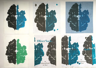
  • I am going to abandon the use of butterfly printing. It adds a really interesting level to my concept (it looks like a Rorschach test, used to trace the thought pattern of someone who doesn't display it openly and to detect underlying thought disorder) but it just isn't working visually. 
  • I might try doing something along the lines of what I have been doing but using paper cut instead (the solidity of this media would allow me to place my image on a coloured background).
  • I am going to take all of my feedback into account when making my new image - incorporating the snaky texture of brain skin and making the faces quite bumpy and ambiguous.

Judge a Book by its Cover: It doesn't look like a brain


What Challenges am I facing?
  • Having spent all day butterfly printing and constructing a draft on photoshop it is just not working. I thought that I could maybe get away with it but I spoke to three separate people and all of them said the same thing -  It doesn’t look like a brain
  • Their reasons were: brains have rough edges and wiggly bits inside. Somebody also suggested using a more opaque media to make it stand out more
  • Another person said that the background looked too plain under such simple imagery and it needed some kind of texture


What is going well?
  • I am happy with the layout of my book and having the two faces facing each other on the cover is really interesting (it is less literal than having just the brain on the front).
  •  I had difficulty trying to crate the repetition of faces across my cover because there was no space for the centre of the brain (which runs down the spine) on the parts that fold in. I resorted to just cutting them out and matching up the two sides. This works really well because it puts a focus on the central brain. This repetition fill the whole cover in a very simple yet interesting way. 

What next?
  • In response to this feedback I am going to go away and do some more butterfly printing using a more opaque media than ink (maybe an ink and acrylic mix or just acrylic?)
  • I am going to focus more on making my image look more like the texture of brain skin rather than a brain scan (appears to be more recognisable to most people)
  • I also want to photocopy my prints and experiment with different ways pf constructing the face rather than cutting straight into the original (maybe making it more ambiguous and bumpy to retain the braininess of my brain)
  • I also want to play around with backgrounds. I am thinking about drawing them rather than scanning in textures (i think a texture might clash with my design a little rather than enhancing it)
  • I need to start considering text layout

Tuesday, 8 November 2016

Judge a Book by its Cover: Week 1 feedback


Having rethought what was said in the crit and spoken to a couple of people I have decided to focus on my blue print brain idea (image two). I think that it communicates a far more interesting concept and I really like its simple elegance. Someone also mistook the brain in the first image for snakes.

Shape and Texture Session


I felt in my element during this mornings exercise. I love playing around with shape and collage. I think that the last one works the best as it is a simple yet an original representation of a banana. It works well as a symbol and I think that the three dimensional element adds an interesting twist to it without taking away from its minimal aesthetic. However, there isn’t much of an evolution found in my images. It would have perhaps worked better to take a simplified image of a banana and tweaked it each time to see where my media would take me. (maybe ripped soft edges might have worked well?)


I’m really not at all happy with my self portrait from this afternoons session. I didn’t apply anything that I have learnt about shape or texture to it. The face is face is totally out of proportion and it doesn’t resemble me in the slightest because I did’t plan it properly. It is also just too purple. I could have made it more interesting by playing around with a larger range of textures, colours and media. At the time of making I was feeling really drained and ill and all I wanted was to go home. I did however definitely in some way encapsulate how I felt at the time in my image giving it a sense of mood.

Monday, 7 November 2016

Judge a Book by its Cover: Illustrator Mood Board

I love the ambiguity of the bottom left illustration. The combination of collage and drawing is really interesting. I also love the book covers on some of Oliver Sacks' other books. A series of them display detailed anatomical drawings of faces overlaid with abstract coloured shapes. I love the modern twist that the shapes give the traditional imagery.

Illumination Crit


  • Lots of people said that this image looked overworked on photoshop and that the plant gets lost in the dark background. This is something that I agree with and always struggle not to do. I definitely need to take a step back once and a while and to stop thinking with my hand. I am going to re edit this image and just set back the city scape and edit out the glue smudges.
  • Somebody said that my tree man wasn't centred but it looks centred to me so I'm not sure how to respond to do this. 
  • Another person said that my images didn't look like part of a set. This was an interesting point as I got from the brief that they were three totally different illustrations that could potentially illustrate the text. I think that I perhaps misinterpreted the brief. Doing this would have definitely given them more visual impact when presented together. It would have also given me more time to experiment with a particular media or colour scheme.
  • Someone asked weather I was trying to deliver a message or a narrative? The differentiation between these two ideas is really interesting. I suppose that in all my images there is a strong focus on the narrative of the article. I guess that the tree man image reminds us that we are natural creatures, as much as we try to separate ourselves from nature. However, it doesn't give an opinion or 'message'. It raises a point and allows the viewer the freedom to respond to a narrative. It would have maybe been interesting to have more of a focus on a message rather than the narrative, perhaps even a focus toward my personal opinion.  


Illumination: End of Week 2 (half finished) Outcomes


What went well?

  • I'm really pleased with how the city scape came out in the first one. The simplicity/ ambiguity of the buildings and the way that they aren't quite in perspective really adds character to it. Collage is definitely a media that I work well in. It's nice to step away from just using line. 
  • I think that the 
  • I think that the concept is definitely reflected really well in all of the images and spending lots of time putting thought into how I was going to communicate my text definitely played to my advantage. Even though it's quite an ambiguous image, I think that the third portrays my message in the most simplistic and interesting way (the evolution of man made back to natural). This surprised me. 
  • I have really improved my skills on photoshop through lots of experimentation and help from my peers. 
What went not so well/ what challenges?
  • I really struggled with time management (only managing to complete two of my three images). I think that this is because I really struggled so make my ideas visual this is something I'm starting to find easier though.
  • I also struggled to make each of my images look finished. For all three I ended up resorting to photoshop which meant I wasted lots of time as I am a beginner to the software. I had in the back of my mind that every image had to look professional but after seeing a couple other people's work I have realised that it doesn't.

What an I going to do next?

  • Instead of trying to make my third image look really professional I am just going to play around with shape and have fun with it.
  • In the next brief I maybe want to go back to basics and try experimenting with and working entirely in analogue media (not relying on photoshop to make it look polished).
  • I want to try working again with collage and shape.
  • I also want to try to move away from my tendency to overcomplicate and to create some more simplistic images. (A complex image doesn't always communicate an idea best)


Wednesday, 2 November 2016

Judge a Book by its Cover: Help, I'm berried in ideas

At the minute I'm feeling quite berried and confused and I'm really struggling to consolidate my ideas as there's so many different contrasting themes running through my book. The preface puts quite a positive spin on neurological disease. It talks about how disease can destroy neurological paths in the brain, which are then reformed in new ways. This allows the person to think differently to the average person, leading to increased creativity and evolution.

However, all of the case studies in the book have quite a negative feel to them. The first talks about a painter who becomes colour blind. What he sees is described as a 'black and white TV screen' yet he is surrounded by a world of colour. This is reflected in the current book cover. The second case study is abut a monk who is seeking solace with an undetected tumour. It has a similarly sombre feel to it.

The conflicting ways in which neurological disease can effect a person has got me feeling confused. I was going to create quite a positive cover about creativity but I'm now not sure. I could look at how disease effects a person's sense of self and weather it is lost or enhanced. This is a strong theme, which runs through the whole book and sums up what it is about nicely. 

I also could explore dreams as the vividly of the patient's dreams is spoken about across all case studies in addition to the thin line between reality and their own created worlds. I could also look at how this creative enhancement is a positive thing in contrast to the negative way mentally ill people are often looked upon by society. This might be an interesting way to explore colour. 

This blog post has really helped me to consolidate my ideas more and I now want to try and separate them in a mind map before I start woking visually. 

Illumination: Week 1 Tutorial


Jamie gave me lots of really constructive help and advice in my tutorial. He spoke about how ambiguity and simplicity are my friend as I'll always have the text to make sense of my image. This was a rally interesting point and I'd like to try to follow it in the coming week as I have a tendency to over complicate, which is often less effective. He liked the ambiguity of my progression of shapes idea. I was surprised by this choice but after reconsidering it I think that it could be really interesting. It will give me a chance to deduct and play around with shape rather than line.

Jamie did agree that some of my ideas reflected something different to what the article was saying. This was annoying because the chicken chicken nuggets was my favourite idea but I can see that it doesn't communicate the article as well as it could.

We also spoke about blogging and how writing bullet points and asking myself questions is a better way of directing and shortening my posts. This is something I would like to start doing from now on.

Questions to ask:
What went well?
What went not so well?
What challenges did I face?
What an I going to do next?

Illumination Week 1: Idea Development


What went well?
  • Having thought of so many ideas I was surprised by how easy I found it to visualise them and I think that some of them are really interesting. The ones which aren't so literal are my favourite. 
  • I have become really interesting in this idea that man is essentially nature yet he tries to separate himself from it through culture. I want to continue to play with this concept but I'm not quite sure how to present it visually yet.


What did I find a challenge?
  • Having so many ideas, I wasn't sure when to stop. I think that I maybe didn't allow myself time to develop each idea much because I was so keen to visualise each and every one (I am now going to have to work hard next week). I wish that I had time to to maybe play around with colour and composition more and not limited myself to pencil. It could be interesting to play around with paper cut, particularly if I go on to pursue a more abstract image. 
  • I also think that I might have gone off on a bit of a tangent with some of my drawings. This happened because I only read and highlighted the article once before leaving it and going mad with ideas.

How an I going to move forward?
  • At the minute I am at a bit of a stuck point, which I'm hoping Jamie can get me out of in my tutorial. I need to choose just three ideas to develop before I can move forward but I really can't decide which ones. In order to decide this I want to ask Jamie about how my image needs to relate to the text. Can it reflect a separate suggested idea? Does it have to literally reflect what the article is saying? Does it have to sum up everything said or can it just relate to a part? 
  • In continuing to develop my ideas I also want to start playing around with colour and maybe try working digitally?

Tone and Texture Session


What challenges did I face? 
I definitely struggled with this exercise and I couldn't get my head around exactly what Matt was looking for. I started by representing my words with shapes and patterns but this wasn't what he wanted. Instead, he was looking for a surface. I really struggled to do this with a pencil without making it too mechanical, but I think that I maybe got there in the end. The key was to just make a repeated mark and to see where your pencil takes you.


What went right?
I am really happy with my treehouse. It was an interesting lesson in applying texture to an image, something I haven't really done before. Using collage to do this bought in texture in a very fluid way without over complicating my simple image. I liked the use of dry brush. I think that it creates a really interesting surface.

What next?
I am really excited to bring texture and tone into my circus drawings. I think that it will work really well to bring in another level of visual interest and animation to my colourful circus scenes.

Line Quality Circus Drawing


What went well?

  • The fact that I had to do 30 drawing of the same image really pushed it in some interesting directions, which it may not have gone in had I not done so many. It really showed me that there are some far more interesting ways of translating an image than the one which I tend to be drawn. 
  • I discovered some really interesting new lines, this one being my favourite:


This was surprising to me because I would never normally think to draw in this way. I like it because it is so simple but the line still has an interest and a character to it. The line quality is unusual but it works really well with this image to capture the essence of the acrobats body.

What did I find challenging?
  • After doing about 20 drawings I got very stuck for ideas, which actually lead me to make some of my most interesting images, as I had to be really creative with media i.e. painting with my fingers.
  • I also really struggled with not being able to draw out my image first in pencil particularly as it is so complex. I was afraid of messing up my sketchbook. However, the drawings where the acrobat is slightly out of proportion are still interesting. It adds a little quirk to them. 
  • I also really struggled using ink. It is a media, which I am really not comfortable using unless I'm doing a huge drippy piece. I find it really difficult to control and mediate. This is something, which I would like to work on. 
How am I going to move forward?
  • I want to continue to be aware of my line quality in future work and maybe come back to using some of these different ways of working. 
  • I also want to try to be aware of line quality when I look at other illustrator's work so that I can explore how they use it.


Line Quality Session


What did I struggle with?
Initially I felt stretched to come up with 30 different straight lines. I found that it took me far longer than exeryone else. I think that this may have been because I was trying to make each line very different in terms of how I applied the media unlike the people around me who appeared to be doing the same line repeated in lots of different media. However, I think that this will work in my advantage, as I have now have a range of very different lines which are going to make my 30 drawings dynamic and interesting.


What went well?
I think that the second drawing of the person was really effective. I like the boldness that the black outline gives it, yet it still has a looseness to it. It is a far more interesting way of representing a person than the first one (closer to my regular drawing style).

How am I going to move forward?
For my 30 drawings I want to play around with one of my contorted acrobats. I really wanted to experiment with line and tone and different ways of translating these images anyway, so this is the ideal brief for me. I think that the fact that I also have to do so many repeats will push my drawing into some obscure and interesting directions.

Tuesday, 1 November 2016

Initial Circus Drawings

This module/ brief has got me really excited. I love its focus on drawing alone, It really gives me the freedom to just dive in and experiment.  I can't wait to use tones of colour and to maybe play around with things like collage.


What did I struggle with?
I feel like I got trapped doing a couple of my drawings in quite a flat cartoony style. This is a style which is easy to resort to but I don't think that it is very interesting, it has no character. I'd like to try to stay away from it and to continue to explore different ways of translating an image. 


How do I want to move forward?
I really wanted to create a creepy, surreal American Horror Story style circus but I got initially sidetracked creating more jolly images. I think that this happened naturally because in order to create something weird and creepy I would need to create quite a layered, atmospheric image. This is something which is challenging but I'd like to explore it further. 

I also really enjoyed drawing the contorted bodies of the acrobats and I think that there is lots of interesting directions I could take these images. i.e. plating around with line, tone, shape etc.