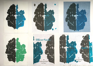
Having spent an entire frustrated day on photoshop playing around with my butterfly prints and trying to put together a cover, it is just not working. I have taken a step back and I can see that I can't just rely on photoshop to make it work. I am going to have to start again and take a new approach.
Why isn't it working?
- I really like the feel of the background and it looks particularly interesting when the colours are inverted and the hue saturation altered. However, it doesn't work under my print because I couldn't get rid of the white from the lighter areas without making it look flat and holey. This means I can't place it on any coloured background.
- Now that I have made my print look more like a brain, the faces look very solid and naive, not the look I was going for. I liked the delicacy of the ink faces on my last cover.
- I couldn't get the text to stand out on the cover without placing it weirdly because there is such a strong contrast between the background and the faces. I asked a couple graphics students for advice but they couldn't solve this problem either.
What have I learnt from today?
- I have leant some valuable photoshop skills i.e. how to import type faces and textures into my photoshop library (I want to start scanning in interesting surfaces and textures that I find around).
- I can now see the faults in my design and I know what to do differently next time.
What next?
- I am going to abandon the use of butterfly printing. It adds a really interesting level to my concept (it looks like a Rorschach test, used to trace the thought pattern of someone who doesn't display it openly and to detect underlying thought disorder) but it just isn't working visually.
- I might try doing something along the lines of what I have been doing but using paper cut instead (the solidity of this media would allow me to place my image on a coloured background).
- I am going to take all of my feedback into account when making my new image - incorporating the snaky texture of brain skin and making the faces quite bumpy and ambiguous.

No comments:
Post a Comment