Monday, 30 January 2017

Frame Session


What went well?
  • I think that using a dramatic composition here is really effective in making a very simple concept visually exciting. I am definitely going to conceder composition more in my future images. 
  • I also think that this works well as a square image. The harsh cropping of the legs adds to the drama of the composition and draws your eye in.

What challenges did I face and how am I going to move forward?
  • Initially, having done a couple compositional drafts I was going to take forward an image not because it was the most interesting composition but because it was the easiest to draw in perspective. I think that this is something that I often do and that I perhaps need to start taking more risks. It definitely pays off and it's even worth having things slightly out of proportion if it leads to a more dynamic composition. 
  • I had lots of trouble with the angle of the leg. If I had more time, I could have got someone to take a picture of my leg from underneath, to use as a reference. 

Storyboarding Session

The Series of Unfortunate Events

What was successful?
  • I think that having an alternation between the the guardian whose house the children have arrived at and the event that happened works nicely to give the story a rhythm. 


What challenges did I face and how am I going move forward?

  • I was surprised at how difficult I found remembering the events of a movie that I have seen so many times. I found recalling the character's faces particularly difficult without reference. I generally find picturing things in my minds eye really challenging but I am definitely getting better at it.
  • I think that I tried to make each sen too complicated. I could have definitely communicated my movie so much better had I made it more simple. For example, just drawing the window in the last box was much more effective than drawing the whole scene with the room and the children looking out of it at their burned down house. SIMPLICITY IS KEY IN STORYBOARDING, YOU CAN ADD DETAIL LATER!

Sunday, 22 January 2017

Tell an Untold Story: Final Book


What challenges did I face?
  • I really struggled with the print settings in indesign, having lost my notes from the induction. I tried to make a final mock up but I could not work out how to make it print at a certain scale and double sided. Thankfully, because I printed in the digital print room I got help and have noted down everything for next time. 
  • I was also baffled by the page layout in indesign and had all my images on totally the wrong pages. I printed my mock up from word and I didn't realise that indesign sorted out all of the pages for you. 

What went well?
  • I am really pleased with how the cover came out. I was worried that black wouldn't show on such a dark paper, but it has actually come out really nicely. The simplicity of it also gives you a bit of breathing space from the quite heavy and busy content.
  • I took a lot of care when binding my book, ensuring that things line up etc. and I think that this has made worlds of difference to how the whole book comes together. The artwork is not much different from that of my mock up but the final one just looks like much more thought and time has gone into it.
  • I also think that the hand made quality of the stitched binding and the paper of the end pages work well with the very handcrafted illustrations.
  • I also think that the large margins work really well to give the detailed images some breathing space.

What could I have done differently?
  • Having printed my book I am not happy with the text on page one. I think that it has printed too big, giving it quite a naive feel. Like text in a kids book. I definitely could have avoided this by doing a to scale mock up of my final book before printing properly.
  • The colours in the images have not come out quite as bright as I would have liked them to be. This is because even though I put them together in the CMYK setting, I forgot that they weren't going to be backlit. I could have avoided this by printing some sample images in colour. 

Saturday, 21 January 2017

Tell an Untold Story: Banishing Figures from Artwork

Following my discussion about having figures being too obvious and slightly distracting I tried to rework the third and twelfth pages.

What challenges did I face?

  • I could see how having figure on page three was too literal and slightly distracting from the subtlety of my other images. However, I was really happy with how my third page was working visually, having put a lot of effort into getting it right. I therefore tried a couple times to repaint it figureless but nothing worked as well as the original (the figure being the key focal point). 

I couldn't work out how exactly how I had layered the ink before and the paper kept going fluffy. I tried to overcome this by repeatedly trying to create my image, each time leaving my layers to dry for different amounts of time but I still just couldn't get it right. 
  • I struggled to make the hands on page 12 look distinct enough against the setting. I kept drying to add bold lights and darks to them to make them come forward but I kept adding it in the wrong place. Why are hands so hard to draw?? ..need to practice


What went well?

  • I think that just photoshopping out the figures face and some pats of his body worked really well (page 3). This is because it just adds a subtlety to my image but it meant that I could keep my original artwork, which I was so pleased with. But is the figure sill too fully formed compared to my other pages??
  • I think that the hands work really well on page 12 to obviously suggest a fishermen without me depicting too much of him. I also like the fact that they don't quite link up, suggesting movement (the fisherman moving through the space or more than one person). 
  • I also think the use of media on page 12 is really nice. The use of quite a solid layer of blue/ black ink links it in well with the rocking chair bridge page, while the extra level of added detail works well with the more busy thinners pages.


What could I have done differently and how am I going to move forward?

  • I think that with page three I may have been better off taking a totally different approach to creating my image all together, rather than trying to recreate something exactly. Maybe using thinners or a dipping pen?
  • Now that I have completed these images I am going to put them into my book, to see how they sit with my other pages. This will tell me if I need to tweak anything else.

Friday, 20 January 2017

Composition - Painting ... not exactly a masterpiece


What works well?

  • I like the fact that I have reversed the hierarchy of the objects in the image, giving the plant more importance than the woman (bigger). This gives the image an interesting dynamic and I like that it is unexpected. 
  • I think that the cropping of the pot plant and table it is sat on works nicely to lead the viewer's eye into the image. 
  • The bold simplistic brushstrokes what form the plant pot work well. I think that I could have been this bold and simplistic in my painting of the rest of the plant. At the moment there are too man marks and it is unclear which leave is which.
  • I think that the lines of white space, which separate the background forms from each other and the plant work nicely. They add to the simplicity of the image (no outlining required) and give the viewer space to breathe. 

What could I have done differently?

  • I really struggled with working solely in ink! I kept wanting to use pencil or pen to draw out the detail but the brief said wet media only. I struggled to control it and to separate the lights and darks (particularly because quink always dries differently as the colours separate). I definitely would have worked better in acrylic. - there is too much texture in the ink!!! I want it to be flat.
  • I don't think that there is enough detail in the background - the woman comes forward too much. However, I am not sure how I could change this without over complicating the image. I quite like the slightly ambiguous blocks of colour in the background. Maybe I could just make a couple of them darker? 
  • Having completed it I am now unsure about the composition. I don't think that I planned it enough - I should have done a slightly bigger tonal draft before tackling the painting. I think that the closest rooftop takes up too much space (almost half of the image!) a third would have worked better (too much blank space). 
How am I going to move forward?
  • I am going to avoid using just ink on its own at all costs and I am going to consider composition more - as well as re arrangement of objects when drawing from observation. I think having something in the immediate foreground gives an image a really interesting dynamic. 
  • Plan Plan Plan

Thursday, 19 January 2017

Tell an Untold Story: Designing my Book Cover


I wanted to keep my cover really simple (just text printed on coloured paper) because my book is packed with detailed illustrations that I don't want to distract from. However, getting the type right was so much harder than it looks so I went to Pinterest for layout inspiration. I think that how the text on Karin Gottshall's book cover is split across two different paper stocks is really nice. Doing something like this with my title would work really well (representing a threshold and the space on either side, perfectly describing a liminal space).

I thought that the first one worked nicely and I like its simplicity. However, I asked some graphics students their opinion and thy preferred the right hand one, saying consistency in type face is key. I personally thought that it was too slick and scientific looking, not representing my subject matter at all (a book not only about space but fractured existence).

All I did was change the type face of the title to Athens, (taking into account what they said about consistency) and it was perfect. The title is quite spread out exaggerating this idea of space but not too slick (because the serifs break it up nicely). I also think that the small type at the bottom balances it nicely. - print on blue stock to match blue of quink?


Monday, 16 January 2017

Tell an Untold Story: Final Crit

What feedback did I receive and how am I going to act upon it?

  • My group suggested making the chair in page 5 orange like in my study (which Matt disagreed with). I am going to play around wit this (maybe in photoshop) because I think that it will tie in well with my coloured objects. 
  • They preferred the hand painted image for page 11, which I agreed with. However, I think that it could have more depth, so I am going to try adding some more darks to the foreground.
  • They suggested making the eye and mouth of the girl on page 10 sharper. I am going to try this because I think that it will make the image clearer, while still retaining its initial emptiness. I am going to play around with the sharpening tool on photoshop and also maybe just try going it with a pencil?
  • They also suggested adding some watercolour to the bracelets (page 6), to draw out certain elements and make them look less mucky. I disagree with this feedback and I like the subtle murkiness to this page. I think that if anything the addition of watercolour will make it worse. However, I am still not totally happy with this page so I am going to try doing this anyway to see where it takes me.
  • Some of my groups favourite pages were the ones with figures (on page 3 and 12). However, Matt thought that I should discard them all together. I can see where my groups coming from because it is clear that I have invested the most time into these pages. However, I do also agree with Matt that the figures are too fully formed and don't work so well with my concept. They almost take away from the delicate absence of a presence on the other pages. I am going to try re-working these pages with more of a subtlety of presence - maybe just adding fragments of a figure?
  • Matt also didn't like the drips in factory image (page 9). I think that this is probably because they don't really add anything to the image and they are quite obvious and almost distracting. I was going to just try photoshopping them out but I think that I might instead try reworking the image, it isn't quite right.

Sunday, 15 January 2017

Tell an Untold Story: Personal reflections on my mock up book


What is working?
  • I think that I have finally put my finger on the image of the gambler after many attempts. It has a nice transience and contrast to it and the figure is finally in proportion. All I need to do is print it slightly darker like the original.
  • I think that the book flows really nicely with the pairings of objects and locations, which is broken up nicely by the text on page one. I also think having big margins on all of the pages works well to unite the content and ensure that the pages aren't too overcrowded.
  • Having quite a simple plane cover, simply exhibiting the the title works well because it it such a busy book. I think that having an image on the cover would be too much.

What is not working?
  • I am concerned that I have come somewhere between creating a jarring contrast between images and not. I am worried that the negative of the wheel sticks out too much? Could I balance this by using a vignette of another object or another negative? Or could I make the black surrounding it less dense?
  • I'm really unsure about the bracelet page and I can't put my finger on it. I think maybe its too over exposed? I could try adding more pencil detail?
  • I am not sure about the bush on page 11. I have done two versions of it but neither really stands out to me. I think both look overcrowded. Should I approach drawing this in a more simplistic way? - just using ink? .. or I could add more contrast to the foreground to crate a grater sense of space
  • I am also unsure about the image of the girl on page 10. I like it as it but can I simply present a photograph in my book? This is something I need to ask the others tomorrow.
  • I am also concerned about the fisherman on the back page, is he too random?? 

How am I going to move forward?
  • I am going to raise these concerns in my crit tomorrow and see if the others have the same opinion before I move forward and start creating more artwork.

Saturday, 14 January 2017

Tell an Untold Story: Finally Some Successful Work

Why are these successful?
Because I stopped using thinners I no longer have the mercy grey patches that were ruining this image. I also think that I finally got the tonal balance right so that the figure is clear but sill a part of the setting. I also think black and blue is a strong colour scheme and it works well with the subject. Could I try using just ink like this for some of my other settings? - the bridge?

I think that this image works well because of the level of simplicity. It works really well to unite my more complex settings with my objects (because like the objects it i a vignette). Using masking fluid on the facade of the house worked really well to stop me overworking it. I am going to use it again in my painting go the bush because in my last attempt there was too much going on.

I LOVE the addition of the creepy oversized hand and its subtle suggestion of presence. I think that it is almost a more sophisticated way of suggesting presence than placing whole figures in my compositions. I am definitely going to start bringing more objects and body parts into my other images.

Thursday, 12 January 2017

Tell an Untold Story: Thinners Prints Troubles


Why is it not working?
  • I’m finding A4  really difficult scale to work on because it is such a big space, meaning that I am spending too long on each image. The level of detail that working on a larger scale is allowing me to add just doesn’t work with this media. This is because there is already so much going on in the thinned photographs that things are just looking too busy. I need to use ink as a means to differentiate things and to make them clearer, not more complex.
  • I am finding it difficult to create strong contrasting images because the ink from the photograph resists quink. This means that I am being left with lots of mushy grey areas, which I cannot work on top of.
  • I cannot get images to print as well as they did in my sketchbook. I think that this is because I am working over a larger surface so am applying less pressure. 

How am I going to resolve these issues?
  • I am going to go into the studio to print a bunch of images A5 so that I can work back in my sketchbook again - so images print better and I'm not tempted to put in too much detail.
  • I am also going to plot out which areas of each image I want to print beforehand so that I don’t end up with too much mushy grey area. 
  • I am also going to create lots of repeats of each image at a faster rate to prevent me from overworking them. 
  • I am going to try painting the gambler just with ink - I have repeatedly tried to do it with thinners and it just isn't working.

Tuesday, 10 January 2017

Tell An Untold Story: Back to Uni Tutorial


What concerns were resolved during my tutorial?
  • Matt definitely helped me to refine my ides and I can see now that creating a personas for the different objects was a total over complication. I think that it would have perhaps have made things too obvious to the viewer. Having an ambiguity to the imagery works well with the ambiguity of presence and non presence. 
  • I wanted to work with colour in some way as I always go for a monochrome palette because I find using colour difficult. However, Matt said that it doesn’t work with my subject matter to use bright colour. This was a relief to hear but I definitely want to push myself to play with colour in the next brief.
  • I was worried about finding a coherent style and media to use throughout my book because I have been working in lots of different ways. We discussed it and I now see that this isn’t necessary. The contrast actually works well with my subject matter and creates an interesting tension. Perhaps even having quite a jarring contrast between pages could be interesting. A flux between black and white and colour could also work well too in this way. 
  • I was concerned about weather or not to have people in my images or to just present the spaces. It was suggested that I have a mixture of both. I think that just having ghostly figures and fragments of people could work nicely. Playing around with scale and flouting body parts to represent presence could also work. 

How am I going to move forward?
  • I am going to print tones of photos and continue to play around with thinners and settings - I like the transience it gives my images. Maybe work into them to draw out details in pencil and ink?
  • I want to continue to play around with negative space and the wheel object.
  • I am going to do some more studies using just ink, I love the calm yet dramatic mood that this gives my work.
  • I would also like to try working with thinners on A4 paper as I am finding A5 too limiting - this will allow me to add more detail.
  • I would like to try adding small spots of colour to my location images.
  • I am also gong to brainstorm things that to me suggest a creepy presence, which I can bring into some of my images - hands, rocking chair, fabric ?

Monday, 9 January 2017

Tell an Untold Story: Setting in thinners

Using thinners for the setting was really effective. I like the disorientated fractured nature it gives the image. The small areas of white space also work really well to break it up, so that it won't overpower my object vignettes too much. However, I don't want to fall into the trap of using his as a media for my whole book. I think that it would be too much and I almost feel like I am cheating drawing over a photograph but I want to use the same media throughout. Would I be better off trying to emulate this effect just using ink?

Tell an Untold Story: today's game plan

I spent this morning procrastinating drawing squares for a storyboard because I was in a bit of a rut. I realised that the layout I was considering isn't going to work because all the pages don't face each other and I was still really unsure what style to push forward. Since sitting waiting in the doctors for an hour I've had tome to reflect and I've thought of solutions to all of these problems:

  • I'm going to make it a Constantina book to solve this layout issue- works better can have person and location on one side and object on the other (maybe this would mean the media don't have to be so united?)
  • Also brainstormed lots of media ideas to try to create a coherent style which will unite my book: 


  1. Draw object with thinners, scan in and digitalise, add text 
  2. Could.. try using thinners for the setting too, paint in figure
  3. Try digitalising objects and doing settings with thinners.. find middle ground 
  4. Also maybe try drawing characters simply with colouring pencils 
  5. And drawing background then overlaying it with a cellulose thinned person?
  6. Try doing person in colour over black and white setting / match up colours in person with that of object
  7. Could try drawing person separate to background in colour/ alter transparency and overlay it in photoshop 

Testing out all these things is today's game plan..

Sunday, 8 January 2017

Tell an Untold Story: Back to the Canal I Go


Today I went back to the canal just to rephotograph some of the locations and objects from better angles to use for my thinners studies. I also got my flat mate to pose as some of the different characters. I think that these photos are going to be a really valuable reference tool to me because I really struggle to draw people in proportion from my imagination.

Tell An Untold Story - Wacom Experimenting

I really want to learn to use a wacom, so I attempted it for the first time today..


What challenges did I face?
  • I didn’t pick a very good drawing to work from (just a quick one I did on location). I realised this near the beginning but I made myself much through and finish it just to try to get to grips with how the tablet works. It would have worked better had I joined up my lines to make more solid shapes, added detail to the leaves and left less blank space (this was the hardest to fill I found).
  • I attempted to create colour swatches throughout the drawing but It would have worked far better if I had organised them all and created a colour scheme at the start. It is really difficult to tell which colour is which from the swatches. 
  • I also should have put the background colour on a different layer to the leaves because I wanted to change it half way through but I couldn’t because I had already added the leave colours on top.
  • I also found jumping between the tablet and keypad a real struggle and I kept drawing unwanted lines. Next time I am going to programme the commands into the tablet so that I don’t have to do this.
  • I also hadn’t decided beforehand weather I wanted to give the image some aerial perspective or a more flat decorative feel so instead it is a weird mix between the two. Deciding this beforehand would have definitely benefited me.

What went well?
  • I have definitely got to grips with the basics of how to use the tablet, which is a super useful skill for future projects.
  • This is also the first time that I have used lots of colour in this project. This is something that I have a tendency to avoid because I find it difficult and really time consuming. I found this was a really effective way of forcing me to use it and I am definitely going to make myself do it from now on. It makes such a difference (gives my work a liveliness).
  • Although it is a little dense next to the rest of the image, I think that the fence works really well. It has a nice three dimensionality to it which you couldn’t see until a added the white.

How am I going to move forward?
  • If I had more time I would like to add some detail to the plants (in black pen) , fill the blank space in the middle and add some more colour to the foreground.
  • Now that I have learnt how to sort of use the wacom I would definitely like to use it again (this time with a better drawing). I was surprised at how much fun I had using it. I think that it is just the thing to inspire me, as lately I have been finding work a massive chore.

Saturday, 7 January 2017

Tell an Untold Story: Developing a Narrative - SUCCESS

I decided to create my own personals for the people who dropped the objects along the canal - the people I met along the way based on the objects I found. I would like to have text on each double page explaining each persona i.e. the nostalgic man or the factory worker. I think this simple use of text will work well to guide my narrative without over complicating things.

How could I communicate this visually?


  • I could make up characters for each persona - to present next to the object. Although I think that this could be over complicating things and I like the focus on location.
  • I could present simply the location along with the object and text. I quite like the subtlety of this and how it just points toward a character. But would I be trying to bring in too many different elements?
  • I could have object, setting, text, ghostly fragmented figure. I think that this could be nice and it would make my message more clear to the viewer than simply presenting them with the setting. 
I'm struggling to find the right type face to use. I think that the one on the left is too solid against the decaying objects and the one on the right is too slick. I might try using lettrasettes (the ones I have are really old so not all of every letter prints - giving the letters a decaying look which works with my aesthetic).

Friday, 6 January 2017

Tell an Untold Story: Developing a Narrative -STUCK

Why am I stuck?
  • I tried to pick out text from the interviews but I found it a real struggle because I wasn't sure exactly what I was trying to communicate, so I separated my concepts:
  1. Looking at the canal as an uninhabited now functionless liminal space that people simply pass through. As they do, all they leave behind is remnants of themselves (objects). These abandoned objects carry a narrative of what came before and who left them behind. A presence in absence.
  2. How the canal is perceived as an idilic setting painted in watercolours vs the reality of it now that it no longer performs its intended function. Also how the canal, like the objects functions to work toward its own imminent destruction when something supersedes it. After which, it is left to be slowly destroyed by the elements. (Cornelia Parker)
  • Having decided on my concept, I mind mapped different quotes that I could place in my book. However, I am still struggling because nothing quite fits with my concept fully. I thought that I could include the reasons for visiting the canal that I collected (to describe the characters who might have dropped the objects). However, I don't think that this really adds to my narrative (more distracting).

I think that the only way that I am going to move forward is if I move away from looking at my interviews and think of my own narrative ..

Tell an Untold Story: Object Experimentation


Although these pages don't work massively well as images, doing these experiments has really opened my eyes to what I can do with an object. I think that before I had quite a narrow perspective on how I could represent these objects visually through simple observation. I think that actually using the objects themselves to rub textures from, draw around and print with really creates much more of a sense of their physical presence within the landscape.
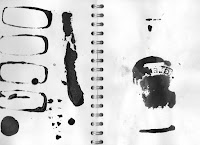
Two things that I did think worked quite well visually was the bottle label - which printed nicely (I didn't even realise it was three dimensional until I printed it) and also the negative space of the wheel. I like the ambiguity of this image and its quite imposing nature. I am going to continue to experiment with these.

Tell an Untold Story: Cornelia Parker


Parker has an ongoing series called Avoided Object, in which she takes objects and transforms their identities through methods of distraction. The destruction of some of the objects is orchestrated by her, while some are natural and others aren't considered objects but negative space. i.e. Territories that people avoid psychologically like underbellies (liminal spaces).

Parker is interested in the memory of an object held in its tarnishes - what has come before. If you morf and rearrange an object is it still a record of its history? How is the history still present if it is not visible? Is it present in the perception of the viewer?


- 'Thirty Pieces of Silver' (1988-9)

Here Parker takes lots of silverware, holding stories of people’s lives and steamrolls it to alter its meaning and everyday worth. It is no longer functional. She suspends the silverware above the floor in a ghostly manner, so that it is waiting to be reassessed by the viewer.

I am looking at the objects left behind by people and how they are remnants of the people passing through the liminal space of the canal. This idea of an object holding a history of what came before therefore really interests me. They hold a memory of time passing in their tarnishes. My objects still hold their tarnishes to indicate their history on the canal but now that I have taken them out of context do they still represent the people passing through the canal and what came before?

Parker uses an interesting analogy of the quick life of a canal to describe how functional objects work toward their own imminent distraction. I am not totally sure what she is getting at but it fits in quite nice with my theme.

'The aspect of deterioration and destruction has an analogy to the brief life of the Canal at the beginning of the industrial revolution. The Canal worked towards its own ‘destruction’ of its intended life’s purpose, by transporting materials for the railways. The railways then surpassed the canal in speed, efficiency and quantity of goods transported, thus rendering the technology of the canal obsolescent.'

Tell an Untold Story: Group Crit


This is my crit feedback from the beginning of the holidays based mainly on my zine. I made the mistake of reading over what was said and taking it into account but not properly reflecting upon it. My zine was supposed to show the objects left behind by people and the places that I found them. I was going to continue to work into the images and to place fragmented ghostly figures within them but looking back on it now, I quite like the raw, suggestive nature of just the ink. It has an uneasy mood to it.

In the crit I asked a question about objects and how I can represent them differently because that is what I was struggling with. I think that this is a really interesting concept but I just really hate drawing objects which is why I am struggling. I would so much rather draw the passers through and the canal.

What interesting suggestions were made in my crit?
  • It was repeatedly suggested that I look at the texture of the objects- doing rubbings etc. Forming the objects out of their own rubbings might be an interesting way to approach making them?
  • Someone suggested that I look at negative space and weather or not we consider these objects an essential part of the canal. Maybe drawing simply drawing the space around or within the objects could be a implistic approach to representing them. I think this question of 'are the objects an essential part of the landscape?' is a really interesting one. It goes hand in hand with what I was looking at yesterday about how mess and things which aren't supposed to be are what catch our eye. Maybe I could look at how the objects have branded themselves upon the landscape. I could try printing with the objects and overlaying images. 
  • Somebody suggested that I look at Cornelia Parker and how she re-contextualises objects. This is something that I was already thinking about so I am going to do it next. They also suggested showing the objects in their former glory. It could be interesting to create a series of characters who have passed through the canal simply through the objects that I found. i.e. the teens drinking from the Smirnoff bottle at night. - although this could be a bit of a tangent
  • Lastly someone said that they really liked the fish interview. I feel that the interviews are something that I moved past quite quickly and I'd like to go back and look at them. I found out some really interesting stuff.


Thursday, 5 January 2017

Tell an Untold Story: Researching The Presence of Absence and Abandoned Objects


 Katarina Weslien (2013) - a hand blown glass ball of water from the Ganga

'Across the room, Katarina Weslien offers us spiritual waters transported from afar, inviting us to imagine the missing location. And as time passes, we witness these waters transform. They become mystically suspended between two worlds, neither here nor there, not what they were nor what they will be.' 
http://contemporaryartscouncil.org/the-presence-of-absence

As well as re-contextualising water, Weslien is also interested in the objects that she finds alongside the rivers she pilgrimages to. She is really interested in where the water/ objects have come from and what has come before. She also looks at how their function is altered when their context is. Is holy water still holy when removes from the source and transported overseas? You could say the same for the objects along the canal. She also speaks about how often things that aren’t supposed to be there are what grab your eye i.e. the mess around the edges of her studio or the objects lining the canal.

I could build an entire book simply of decontextualised objects - tell a narrative of the canal without the canal. Or I could look at drawing the canal with a focus on the misplaced objects? The objects imposing on the setting?

Themes: Abandoned objects, remnants of people
I am finding it really hard to research these themes simply on google because everything that comes up is totally irrelevant. Could I use better key words? I am looking for any stories or writings about them and perhaps artists that look at them. I did find lots of art exhibitions about ‘the presence of absence’ and it was interesting to see how different people explore the same theme. Some artists took objects out of context while others used lights to illuminate what wasn’t there. I think looking at how artists use objects in their work is where I need to head next.

Back to Uni Madness

The whole of yesterday's session went totally over my head, there was so much information. It has left me feeling really stressed. I can't believe how far along with the project we are supposed to be by comparison to where I am with it. I thought that we had three weeks to complete the book but it turns out we have just over one.

I spent quite a lot of time in the holidays drawing the canal with a focus on my theme of liminal spaces (trying to paint ghostly figures and experimenting with media). But in actual fact i think that I have done everything the wrong way round. What I should really have been focusing on was doing more research and trying to develop a narrative.

My Game Plan (for the next three days):

  • Look back at and reflect upon group crit
  • Blog about created images - what works and what doesn't.
  • Think about the focus of the book. Is there some way I can bring the collected ephemera and the places where I found them together through a narrative? Do I need to focus on just one or the other?
  • Read back through the interviews. Are there any quotes that I can pick out and tie into my narrative?
  • Maybe go down to the canal and pick up more objects?
  • Look at illustrators who look at the themes of presence of absence, liminal spaces and who use objects in their work - Cornelia Parker?
  • Maybe research more into the remnants of people/ things to suggest their presence in absence and abandoned objects.
  • Think about what kind of mood I want to convey in my book. Do I want it to be quite heavy or just lightly challenging to this idea of an idilic city canal.
  • Once honed in on ideas start storyboarding potential narratives - three
  • Continue with media and image experimentation (don't get carried away trying to make them look perfect - QUICK! QUICK! QUICK!) Hopefully this will result in some samples I can present in my tutorial.