Saturday, 25 February 2017

Colour/ Value - Fan Poster


What works well?

  • I think that changing the men so that they all face the same way works really well, particularly on the offset prints. It is as if they have got up and walked off from their space in the lettering. 
  • I think that the fact that the men aren't solid fill also works well because the white behind them shows through. It also reflects the rough texture of Giacometti's sculptures well.

What could I have done differently?

  • I don't think that I really utilised the white of the paper as well as I could have and it would have been nice to have left more blank space. I think that there is too much colour and it overpowers the image! It would have been more subtle to have left the background white an just done the letters in colour. 
  • I am also not sure about the red. It works aesthetically but it doesn't really match the subject matter of my poster. It is not a colour that Giacometti uses in any of his work. I wanted to use a softer colour but this is a compromise I had to make because I was sharing a screen. This is definitely something that we should have decided on together before doing our designs. 
  • This was such a nice brief with so much scope and I think that by focusing on type I maybe limited myself too much. It would have been nice to have done something with image, which would have allowed me to experiment more with half tones and overlapping colour. Having said that, I have never used true and image together in my work and it was fun to explore something new. 

How am I going to move forward?

  • Skreenprint is definitely something that I want to do more of, now that I have got to grips with how to do it. I think that it is a really good media for me because it forces me to be more selective and to refine my complex designs. 

Gifs: Final Critical Analysis


  • I think that it might have worked better had I done a digital drawing or angled the face slightly differently in the third gif. This is because I think that my approach and use of media is too similar to that of the second. This means that it does't work so well as a series because the first looks like the odd one out. 
  • I also found in the crit that something unexpected or whacky happened in my favourite gifs. I think that maybe I could have put more thought into how I animated my character rather than just the character design. This is particularly true for the third gif, which I think is too obvious. 
  • I also liked the gifs where the character was performing a single quick action on a good loop. This fast eternal movement became difficult to watch over and I really liked this effect. I think that it would have been nice to have put fewer frames in one of my gifs to have this effect. 

Gif: Finished Digital Gif


What works well?

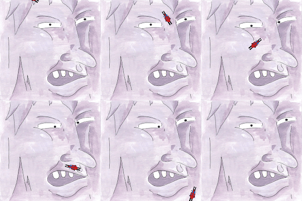
  • I like the use of pinks in the face, rather than greys. It gives my man a warm fleshy appearance and works well with the red hat of the skier. 
  • Making the skier move smoothly took a long time because each time I adjusted his angle I had to put him on a new layer. However, I think that this payed off and I like the way that he snakes down the image totally oblivious of the face. 
  • I think that the fact that the face fills the whole image is interesting and I like that still works in the series but takes a very different approach from my other two gifs. 


What could I have done differently/ improved?

  • I definitely should have played around with making the skier's hat move before I animated him. Making him snake down the mountain face took so long that I didn't have time to redo him. Maybe I could have made it flap side to side instead?
  • If I hadn't been so pushed for time with this project, I would have done a digital drawing for this one. I think that it would have worked better in my series as it would have shown a wider use of media and different approaches. I also really want to get better at using a wacom.
  • I think that I definitely could have made this gif simpler. At the moment because of the way in which the skier moves I have a crazy number of frames, which made it impossible to get the eyes to move in unison. It definitely would have been better if the eyes were moving back to their original position as the skier was coming down the top of the screen but when I tried to alter the position of them in the first couple of frames it changed their position in all of the following frames. I therefore couldn't get out any of the glitches without repositioning the eyes in all the other frames. What am I doing wrong here?

How am I going to move forward?

  • I feel as though I have gained so many new skills in this brief, probably more than in any other. I now know how to make a moving image!! I definitely am going to continue to do this in my free time and I already started playing around with turning some of my old illustrations into gifs. 
  • I also made me see how important exhaustive idea drawing is. The characters at the end of my book were much better than the ones at the beginning because I got the hang of it and they tended to be more wacky because I had time to process and rethink my concepts. 

Wednesday, 22 February 2017

Gif: My Digital Gif is NOT Working


What isn't working/ how can I change it?
  • I made three versions of the skier, each with his hat in a different position, so that it looks like it is waving in the wind (in the first 15 frames). But because he's so small that you can't tell it's moving at all. I would leave him like this but I'm not sure you can tell he's a skier and it is unclear that it is a hat. I am going to ask other people for their opinions on this before changing anything.
  • I am also having real trouble with his eyes, they look really glitchy because its really difficult to line them up, when each time I have to move them from their position in the first frame. I'm also not quite sure how to move both eyes together so that they both look at the skier as one has to move much further than the other. I might try filming myself watching my finger move down my fact to see how my eyes move. This would be a useful reference. If he started by looking at the picture plane then this might also work better because both eyes would move inward at the same speed!


Gif: Final Stop Motion Animation


What works well?
  • The colours came out very differently when scanned into photoshop than in the original paintings. However, I think that this was a happy mistake. The sombreness of the cold blues and greys works well with his mood. I also like that you can see the texture of the paper in the background and how it isn't quite white. 
  • I also like how the images aren't quite the same, so that the other mountains move slightly as he does adding to the hand made quality. It also enhances the drama of him being woken up.
  • I like the fact that him standing up and a giant pair of feet appearing is quite unexpected. The fact that the first frame is delayed for a couple of seconds adds to this surprise. 

What could I have improved/ done differently?
  • I still didn't manage to get the eyes in the original image quit on point. The left hand eye is too thick and angled slightly wrong. Could I fix this on photoshop?
  • I definitely could have put in some more frames, I don't think that 8 was enough. This would have made it less glitchy and his movements more clear.


How am I going to move forward?
  • I am so bored of drawing the my mountain man!!! In my next gif i am going to take a new approach and zoom in to just his face. I could try looking at it from a new angle or have different component moving instead of his face? What could I add in?


Gif: Finished 3D Gif


What works well?
  • I think that making his movements slower also makes a massive difference. They appear smoother and it is easier to watch - matching the 'cool' mountain man aesthetic. 
  • I think that the setting works perfectly with the man and I like the contrast between the snow and the dark wood. The warm lighting also works well with the warm flesh colours.
  • I like the fact that there camera isn't held completely still, to give my gif a slightly handmade quality. It's nice how the viewpoint shifts in conjunction with his feet to make the movement more dramatic.


What could I have done Better?
  • I don't like the jolt between the different dance moves so that it is not on a continuous loop. I could have left it as just one move but I liked the variety. I was tempted to reshoot it when I got home but I knew I couldn't recreate the backdrop. 
  • It would have been nice to have animated his face slightly. Maybe I could have made some eyelids, so that his eyes could move open and closed.

How am I going to move forward?
  • I am going to go on to do some observational drawing from this model before I go on to create my next gif.  This will help with the angles of his face. I would also going to do some experimenting with colour, using a similar palette to this.


Gif: Gif Not Working Well


Why isn't it working and how am I going to change it?
  • The image is too jolty so next time I am going to take more frames and move him less each time. I also don't like the fact that his hands bend back in an inhuman way, I am going to try to avoid this. 
  • I think that he's also moving too quickly and I would like to add in some more slower movements. Maybe have a variety of dance moves? I tried putting is hands over his eyes and slowly revealing them again. This worked really well because it involved his face without me having to move it.
  • I think that the snow is a little too much. I am going to take some it away and have the wood behind showing through, so that he stands out more.
  • I would like to try shooting it in the morning so that i have a warmer light (the images that I took before it started getting dark are much more beautiful).
  • His hands got increasingly squashed because I wasn't moving them delicately enough. I need to fix these and the points on top of his head. 

What is working?
  • The snow works really well to cover the stand and with the mountain subject matter.
  • I like the way in which his body whole body moves slightly, so that it is not just his hands moving. Maybe I could try doing something with his feet?
  • A couple people said that he looked like Donald Trump, which I can totally see. I am going to rename him Donald the mountain troll.


Gif: Redrawing my Character and Making it 3D

What went well?

  • I think that the colours work really well on my model and I love that the snow and limbs are a slightly fleshy colour, slightly resembling hair and giving it a human quality. It also makes his white teeth and hair pop out. I might re-adopt this colour scheme in my other gifs.
  • Mechanically his arms and legs move very fluidly in addition to retaining their place when I move them. This will work well when I come to animate him.
  • Making my 3D gif first was a good idea because it means that I can draw from it, when I go on to create my other gifs. I have been really struggling to envision my character from different angles. I couldn't work out what was wrong with the eyes and I can now see that I was't cropping the left hand one enough.

What challenges did I face?

  • Making my man out of plasticine took a lot longer than I anticipated because I had to slowly build his body up around the wire frame. I am now worried that I am going to be too pushed for time (I only have two full days left)!!!
  • Because his arms are quite thin the the plasticine keeps melting off them. To avoid this happening I am going to leave him in the snow for a while before I animate him so that the plasticine hardens. 
  • I am also concerned abut the fact that he doesn't stand on his feet but I don't want to have to photoshop out a stand in every frame. If I put him standing in snow I could try and use this to cover the stand!?

How am I going to move forward?


  • I am going to leave him in the snow to harden, build a set out of snow and animate him. I quite like the idea of him wacking out some funky moves I think that it will work well to contrast his pissed off facial expression.


Gif: Disaster!! I left my sketchbook on the plane!!

I left my sketchbook with all of my character designs and initial story boards for my cactus worm on the plane!!

  • Before losing my sketchbook I started thinking about how my cactus slug would move but it just wasn't working. Why?:

-I really struggled to work out how to create a sense of its body pulsing through a series of drawings. I tried to study videos of worms and snakes but I have such a phobia of anything that slithers that I had to shut it down. I am not getting excited by this character like I was by my mountain face so I think I am going to go back and continue to develop him instead.

  • Thankfully I took lots of photos of my mountain character, so I can easily recreate him (which I couldn't with cactus slug). Loosing my sketchbook therefore is not going to effect the progression of my ideas and gif design (the only thing was a couple side notes about how I could move forward). However, I feel like I have lost a little piece of me and all the work that I put so much time into is now gone. I am so tempted to redo it so that I don't loose all my marks (I can remember exactly what was on each page). But I know that this is totally unproductive and will not help me move forward. From now on I am going to write my phone number and email address on all of my sketchbooks!! 
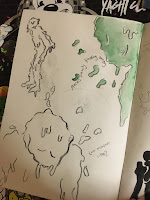
These are some photos that I took of the first half of the book before I lost it:


Gif: Week one tutorial feedback


What feedback did I receive? 
  • Every person drew a totally different one of my character designs, which meant that it did not really help me to solve the question go weather to use my cactus creatures or my mountain man. This was the feedback I was hoping to get out of this tutorial. 
  • However, the importance of maintaining a simplicity in your character is something that came through generally in the discussion. I think that if I use the mountain face I might try taking him out of the mountain range.
  • It was also interesting to see how somebody else saw my images being animated so differently to me and it has definitely given me more ideas. i.e. the mountain man being angry at being awoken from his sleep and trying to interact with the mountains around him / the worms pulsing and slithering around each other (although I'm not sure how I would achieve this??)
How am I going to move forward?
  • Before my tutorial I was set on doing the mountain troll. I was really excited to make him out of plasticine and I already have an idea of how I would approach each of my animations. However, the general consensus in the group today was that they like my more simplistic characters (particularly the cactus worm). I think that this is maybe because they have more of a universality to them? I am therefore going to start thinking about how this character might move and to start doing some storyboarding.

Tuesday, 21 February 2017

Illustrator workshops notes


Image Making (with pen tool):
  • Each layer is actually a folder which you can rename - groups all your lines
  • If your tracing an image - double click the layer and click trace on the image settings (change the opacity to 20 percent)
  • If you want any guides (i.e. if its a symmetrical image and you only want to draw half of it), get the rulers up (view, rulers, show rulers) then put the guides in a new layer and lock this layer so they can't move
  • to reflect a shape - select the layer - object , transform, reflect then copy to keep your old layer. OR (a quicker way) - click the rotate tool and on the drop down there is a reflect tool. click alt then on your guide (reflection line) and it will reflect
  • to join the two sides of the reflections - select the two sides, object, path, join
  • NAME ALL YOUR LAYERS and do THE BIG SHAPES FIRST
  • when drawing a circle hold down alt to draw it from the centre
  • to group different things together - select all, object group
  • to change the thickness of a line or whatever - click with mouse and change in top panel
  • to duplicate a shape, press alt and drag
  • If something is grouped and you want to colour just one part - you just double click the object to enter isolation mode - now you can edit parts separately
  • to fill a small part coming off a big shape (i.e. claws) you make it a big round area, fill then click object, arrange, send to back (to send it behind the main body

Adding Type Along a Path:
  • Draw line with pen tool, click type tool, bring mouse toward path and wavy line icon pops up (if it doesn't press alt) then start typing - you can also add it around a shape (command [ puts an object to the back)
  • When you draw around a shape it takes away the fill - so click on the shape - edit, copy in place


Saturday, 18 February 2017

3D Gif

file:///Users/indiapenny/Desktop/nnnnnn.html

file:///Users/indiapenny/Desktop/aaaaaa.html

file:///Users/indiapenny/Desktop/bbbbb.html

file:///Users/indiapenny/Desktop/mmmmm.html

Saturday, 11 February 2017

Gif: Help me this is impossible


  • I am finding character design a real struggle and I am finding it really difficult to invent something from my imagination. I need reference!! I find that I keep coming back to this faceless nature man (because I never know how to draw facial features and the song reminds me of nature) but I really want to move away from this and do something new. Maybe a better approach could be to the something directly from nature (i.e. a mountain, leaf, tree and personify it)?? Then I already have a base shape to work on top of. I think that a mountain could be interesting - this would also work well for 3D because I'm going skiing next week.

Tuesday, 7 February 2017

Dominic Kesterton Lecture


  • I thought that what Dominic said  about doing illustrations to sell on products in addition to commissioned briefs was interesting. It seems like a really good extra source of income as well as giving him some time and freedom to do the work he really wants. I also liked what he said about using this work to shape the direction of his personal work because it all goes into his portfolio.
  • I had also never heard of reesograph printing before. It is a really interesting way of working and I'd love to try it. I always wondered how those screen print effect posters were produced. It was also interesting what he said abut his application of media shaping his style (uses lots of bright block colours).
  • He also spoke about how he really liked very refined characters 'slightly above stickman level' because they are so generic that anyone can identify with them. This is a really interesting point that I want to consider in my upcoming gif brief. - I need to step away from my tendency to overcomplicate. Simplicity is key.

Gif: http://dominickesterton.com/The-New-York-Times
I love how simply he has animated this gif, just animating one part not the whole character. It is so simple yet it really creates a sense of the apple balancing. I would like to try doing something similar in my digital gif. 

Gif experiment


What challenges did I face??

  • I struggled with controlling the file size. I made it too large so the animation is glitchy. - next time make it 72dpi, not 300. I also found that it was super glitchy in photoshop up until I exported it. Maybe try making my gift on a uni computer instead?
  • I also got confused by putting new objects in certain frames. If you put it in one, it would appear in all the others. I worked out that this is controlled the eye next to the object in the layers panel for each frame.