Tuesday, 28 March 2017

Self Evaluation


Persons of Note - Final Crit and Reflections


The three main words used to describe my work in the crit:
Fragmented/ eclectic, robotic, melancholy

What am I happy with?
  • I wasn't aiming for a robotic aesthetic, I was more just doodling and trying to find different ways of bringing the fragmented limbs together. However, I guess that this does reflect the unnatural, prosthetic feel that I was trying to give the figure.
  • I am also really glad that people described my work as melancholy. This was something that I really focused on communicating in my jars but then moved slightly away from in my poster. I am not sure if this comment applied to just my jars or my poster too. I hope that it could be applied to my poster because even though I used colour and quite cartooned marks I did want it to have a slightly dark creepy nature to it.
  • I feel that my poster works well as a single image to communicate a combination of different things at once. Different fragments (as described in the crit) of ideas and layers of meaning are forming. I am really pleased about this because it is something that is quite difficult to do. It was made possible by the depth of my initial research and I loved that in this brief I gave me the time to go into so much depth. 
  • I also think that the way in which the jars on the postcards have been directly incorporated int the collage. This works nicely to unite my series and add another level of meaning to my collage.


What could I have done differently?

  • I think that the stamps perhaps could have been more considered. I do quite like their aesthetic and the way that they work as a series of four but I think I could have considered what I put in them more. Maybe I could have designed them separately, rather than just taking crops from the poster. I could have also tied everything together better if I had put parts of the jars in some of them.
  • I also think that generally in this project I started making quite finished looking images too quickly and I could have done a lot more quick sketching and planning first. This is something that I have been constantly trying to steer away from and I think that I slightly snapped back into old habits here. 


How am I going to move forward?

  • I think that in future projects I need to try to put aside more time to do my initial research. I feel that this is something that really drives my ideas and my most successful projects so far have been the ones where I've done this. 


Sunday, 26 March 2017

Persons of Note - Where am I at and How do I Finalise my Work


My Thoughts on What I've done
  • At the moment I'm torn between the two posters. I like the top half of the right hand one but the legs of the left. I asked my flatmates for their opinion and they agreed. I was considering doing another poster that combines all these elements but I feel the torso might be too much, with the legs of the left, unless I reduce it down a little? 
  • I also can't decide between the postcards - I think that the three jars would work well together (if I took out the bell jar) but then I'm not sure about the nose. It is much more refined end less obscure than the other jars. I quite like this obscurity. I might lay all four out at the crit tomorrow and see what other people think.
  • As for the stamps, I know that I definitely want to do croppings from the poster - some of close ups of the jars/ the marks around them and some of simply the marks. I think that this would tie the series together nicely. However, I can't do this until I've decided upon my final poster design (I might do some samples for tomorrow from the posters that I have just so that I can get some feedback). 
What am I going to do next (before digital print - tues)?
  • Paint a third poster combining my favourite elements from these two.
  • Re - scan two of my postcards with the uni scanner, so that they match the colours in the other two/ resize so equal (stretch woman in jar?)
  • After crit re - print collage elements on poster with uni printer and stick over (for better colour/ quality) then scan in the whole poster - resize ready for print.
  • Take four croppings from the final poster/ size properly for print (stamps) - put them all in a single photoshop document with the cropping marks for print. 


Thursday, 23 March 2017

Persons of Note - Week 2 Group Crit Feedback


What feedback did I receive?

  • In my group crit I had a very mixed response as to weather people preferred the jar drawings or the collages. People seemed to think that the collages seemed to have more of an interesting concept and gave more depth to my jars but it was a shame to shrink them down so small that you can't see any of the detail. 
  • People also agreed that the face was too obvious and almost preppy. They also thought that it did't fit in well with the collages (your eye is instantly drawn to it).
  • My peer tutor suggested redrawing my hand in a jar so that it takes up almost the whole thing. He thought that this worked really well with the foot. 
  • Everyone agreed that blue was the best colour to use in the collage because it goes well with the blue in the ink.

How am I going to respond to this feedback and move forward? 


  • I am going to begin by redrawing the jars with the hand and the head in them - I am going to draw both of them larger. With the face jar I might either vaguely draw the whole face but only focus on one feature or I could just draw one enlarged feature? A jar filled with a nose?
  • For the poster I am going to do a collage then for the three postcards I am going to present three of the jars. I think that this will work better than just putting the jars on the stamps because you can still see the detail, which people liked. Also, if I do this then I don't have to necessarily put the same jars that are in the collage on the postcards. This means that I can utilise the jars that work well to communicate my idea but don't work in the collage.
  • I am going to use blue acrylic in the poster.
  • I am need to look into some other artists work!! - blog George Douglas and maybe look into some more collage artists?

Monday, 20 March 2017

End of Module Evaluation


Persons Of Note - George Douglas


I just love George Douglas' way of working. I like the fragmented feel of his images and the way in which he ties together both drawn and collage elements so well (without loosing this slightly detached fragmented feel). I think that using one bright colour in some of the drawn and collaged elements is a really good way of doing this because it makes some parts of both jump out, while others sit back, giving them an equal level of importance. His use of composition is also really interesting because it initially appears random but you can tell it has been carefully considered. (i.e. the addition of the simple black scribble on the right of the figure in the right hand image, which balances in perfectly.)

I think that working in a similar way to this for my poster will work really well for me. At the moment, I have many fragments that I want to somehow bring together in a slightly disjointed way to represent this idea of 'being stuck back together again with glue'. However, I would like my figures to have a slightly more robotic, mechanical feel than those of George Douglas (to reflect this artificial reforming).

- But I need to be careful not to copy

Sunday, 19 March 2017

Persons of Note - My Reference Images


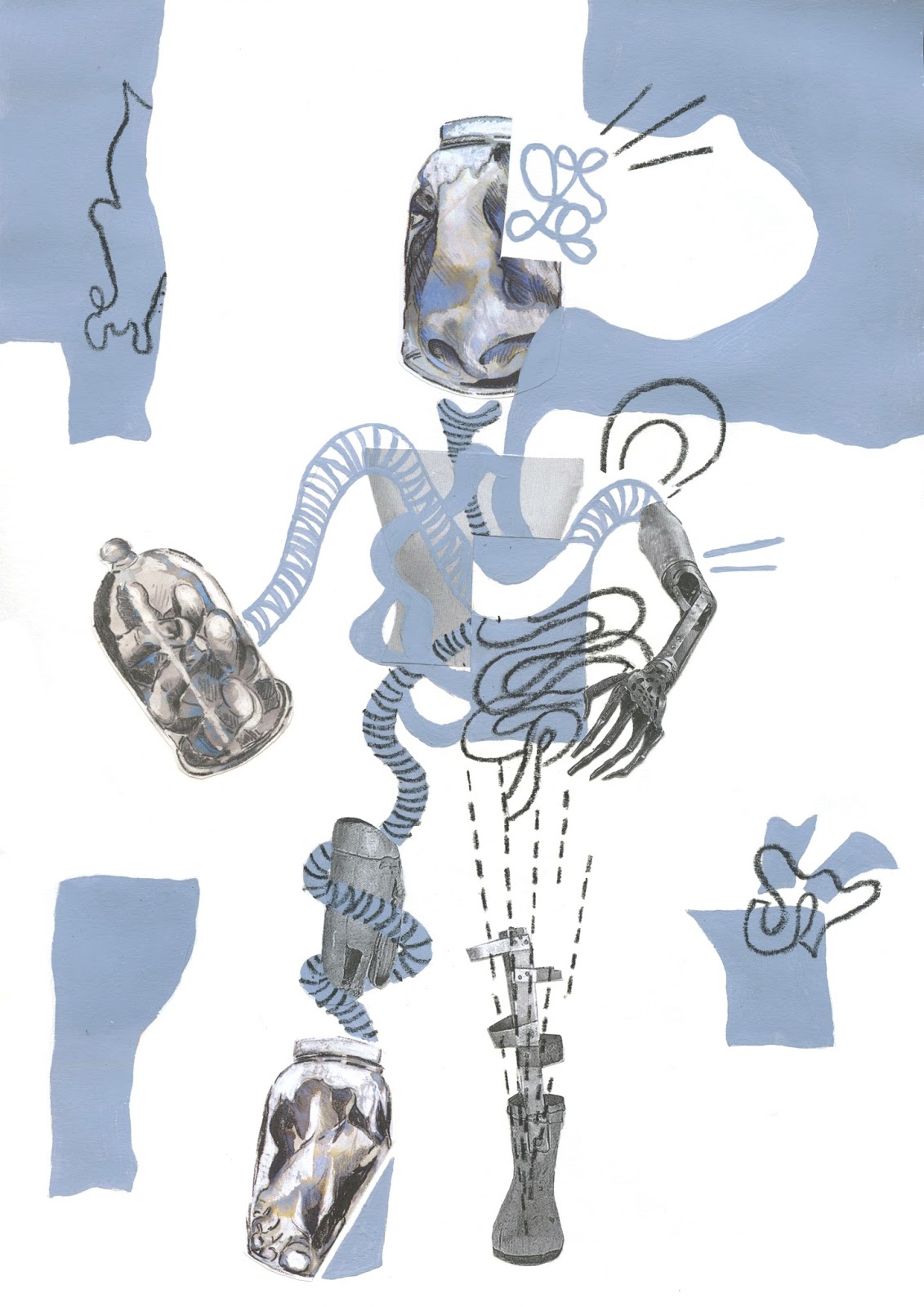
I was really struggling to find images of distorted body parts/ body parts in jars online (only foetuses) and drawing them from my imagination was too much of a struggle so I decided to take some reference photos of my own. The images of the distorted hands and feet were ideal - all I had to do was place them in a jar. However, I had much more trouble with the face. I would have ideally liked to buy a bell jar and have placed my own head inside it but I couldn't find one big enough. I found that when I was drawing from my own face I was putting in too much detail and I could't work out what to leave out. I wanted the head to appear to be floating in a dark liquid. I also wanted it to resemble Sylvia Plath more.


I tried this placing Sylvia Plath's face in a jar. The result is a vast improvement from my other drawings but I am worried that it still looks too two dimensional. I think that this is because I was drawing from an over exposed photograph. It kinda resembles Bowie...

I think that I need to try obscuring the image more? - maybe zooming in on a certain characteristics? Adding more darks, depth/ things overpaying her face = bubbles, swirls, reflections - TOO OBVIOUS
I am going to present it in my crit tomorrow and see what everyone else thinks


Saturday, 18 March 2017

Persons of Note - It's time for a change


I feel like I have reached a slight end point with what I am doing - at the moment I feel like I have just been repeatedly doing the some thing over and over and I have almost forgotten what I was trying to communicate in the first place. I need to work out what this was and find a new direction to head in now.

What have I been trying to communicate?

  • So far I have looked at this idea of being trapped within the bell jar of her madness
  • I moved on from placing her whole body in a jar to specific body parts - less literal = to reflect her obsession with death self distraction
  • Even though I have been using quite bold marks I have tried to maintain a beauty to my images by applying the quick quite delicately particularly in the face - to reflect the sort of beauty Plath saw in death - something which is not to be feared and that comes hand in hand with poetry.


How am I going to move forward/ what other ideas do I want to communicate?
  • I would like to sill utilise it but I want to start expanding out of the jar format. I am starting to find it quite limiting. - collage
  • I am going to move on to look at this idea of people sticking her back together again ('they stick me back together with glue' - Daddy poem) every time she tries to self distrust
  • I would like to use the jars containing her different body parts in my collages (still reflect the same things - most importantly the idea that although she has been put back together again she is still trapped within her own terrifying world obsessed with death.)
  • I might try experimenting with drawing and collage - maybe images of prosthetics?? - their attempt to reconstruct her and take her out of this world (through things like electric shock therapy - destroying what exists and replacing it with something artificial)
  • I could try adding in a colour? - blue to match quink??
= a metaphor for them trying to mentally reconstruct her (electric shock therapy - erase memories etc.) - what remains of her is still trapped in this world

Thursday, 16 March 2017

Persons of Note - Week 1 tutorial feedback response

What is my intent/ how am I going to move forward?

- I am going to focus on looking specifically at the bell jar being a metaphor for Sylvia's state of being within the world that she has created for herself. A terrifying self contained world where everything is distorted from reality. 

- distorted
- chaotic
- unclear
- reflected
- glued back together again

('But they pulled me out of the sack, And they stuck me together with glue' - Daddy, poem by Plath) I think that this is an interesting concept and I would like to start playing around with trying to represent it visually - taking a figure and reassembling it. - collage/ drawing combo - drawing from collage

For this distortion idea I would also like to take some reference photos of myself (face) to work from - although it might be interesting to do a whole figure? Jamie suggested buying a ball jar and photographing my face inside of it. - I found the foetuses in jars really interesting to draw and I liked how the different body parts drifted in and out of focus in the liquid - I could maybe do some more drawings like this? 

At the moment I am not sure if I want to do something which is bold and disturbing or something which is gruesome yet beautiful at the same time (maybe in pencil? - like my original foetus drawing) but I am going to start working using bolder materials (just in black) 

- charcoal 
- chinagraph 
- resist?
- pencil 

And I need to start working BIG!!!

Wednesday, 15 March 2017

Drawing on Location - York


What Went Well?
  • I can see that when we were at the train museum, focusing on different elements in each image (i.e. tone, mark making etc.) wasn't just an exercise. The images where I was selective with what I put in and just worked with straight lines or block colour are much more visually exciting than my first drawing, where I just sketched what I saw. 
  • I finally felt comfortable working with colour, which I didn't at all in the first observational drawing task at the beginning of this module. Before I just saw it as another element to control - like perspective and line quality, but now I can see that it can be used to aid or as a substitute for these other things. I.e. in image three I used colour to differentiate different objects from one another so that I didn't have to use tonality to separate the objects and create a sense of depth. Had this image been all one colour it would have been confusing.
  • In the afternoon, I also started to play around with creating depth (image 4). I separated the landscape into three separate planes (as I did in the Depth task) and tried to reduce the level of detail in each as I went back. I found that pen was a good media to practice doing this in because I didn't have to consider tonality as much as I did when painting. - works well to add a clarity to my image 
  • I also started to play around with mark making and trying to find simple ways of representing each of the serrate bushes through mark making. i think that these areas of image 4 are much clearer and more interesting than the areas where i have scribbled or tried to hatch.
What challenges did I face/ could I have done differently?
  • I think that I could have spent less time on each image, so that I could have had time to complete more of the tasks. In the train museum I would have liked to start looking at how the trains were constructed and maybe have tried deconstructing them. I also wanted to do some sound maps - I could have looked at the differences between one in the museum and one in the park.
  • I also don't think that I considered composition enough. I could have tried looking through something or up at something. A lot of my drawings are very cropped, as if drawn from a photograph because I just started drawing one thing then expanded it until it filled the page. I could have started to play around with rearranging objects. 
How am I going to move forward?
  • Next time I drew from observation I am going to make sure  work in pen - so I can't rub anything out! And I am going to use a bigger sketchbook so that I can be more gestural and expand out of the frame. I found A5 confining. I would also like to continue to use colour in my observational drawing. 

Depth - Drawing out the Window

What went well?

  • The fact that we had to separate our image into three planes or cutouts worked well because it forced me to consider the different my planes of my image and how I was going to alter the tonality and level of  detail in each to create the illusion of depth. This is something I tend to forget about when drawing from observation. I think that the change in the way in which I use materials works well to achieve this - from pen / bold use of ink to pencil and a light ink wash. 
  • I think that the cropping of the different layers works well to draw your eye in and it adds to the chunky layered quality of the image. It makes it look like a quick snapshot, which I like.
  • I also like that the front building is parallel with the picture plane - breaking the v of perspective. I like that this is unusual and stops the viewer's eye initially moving back because I want the front layer to be the focus. (I hate images which look straight down a street or path with a giant V of perspective in the middle of them - boring)


What could I have done differently?

  • I am unsure about my use of materials - I think that things get a little mushy and unclear in the middle of the image. I could have changed this by laying down the wash before the pencil (so that it didn't pick it up). 
  • I could have perhaps tried using two colours rather than one. This would have made things bolder and more clear. Although I think that this may have taken away from the gentle simplicity of this image. 
  • I think that I could have also been more daring with my subject matter - maybe looking through something or I could have put in something closer in the foreground -i.e. the library books that I was looking past and out the window. Or even something that doesn't exist in reality i.e. a giant dinosaur stepping over the buildings? 


How am i going to move forward?

  • When drawing from observation I am definitely going to consider the different planes of depth and how I separate them more. - LESS DETAIL AND TONALITY AS YOU GO BACK - splitting the image into just three planes is a really good way of tackling this 


Monday, 13 March 2017

Persons of note - further research into Sylvia Plath (nonsensical notes)


  • took her own life at 30 - had an obsession with death and suicide throughout her life - clear desperation / violent emotion evident in her poems 
  • did not conform to the traditional role of woman at the time - women don’t write poetry
  • possible reasons for illness - negative vision of self/ struggle to find a valid personal identity/ loneliness, difficult marriage (unfaithful husband) and unresolved family issues - fathers death / mother not understanding her
  • did this happen from domineering father, demands of motherhood, unfaithful husband?
  • this idea of conscience is interesting
  • received electric shock therapy - can cause memory loss / permanent brain damage - Did this make things worse? - it may have triggered the first suicide attempt
  • It is as if my life were magically run by two electric currents: joyous positive and despairing negative—whichever is running at the moment dominates my life, floods it.” - like bipolar??
  • in Aerial - poetry and death don't exist without one another 
  • she sees death is preeminent but unoppressive
  • attempted suicides; slit wrists, hang herself, drown herself, over dosed on pain killers in a crawl space but was found 3 days later still alive (felt like she had been in oblivion)


  • she believed that the awful events of past are simple reminders of the terrifying human mind 
  • often uses events in history to explain her self and own feeling - writes about a concentration camp as if she is imprisoned there in 'daddy' (poem)
  • speaks here as if her dad is the one who put her there referencing him to a german (aryan eye) - by dying no her and breaking her heart
  • speaks about how she first attempted suicide to see him again - but thinks he’s a bastard for dying on her - lost all faith when he died
  • imagery: tongue stuck in jaw, barbed wire, CHUFFING?, big boot, cleft?- in chin instead of foot.., bit heart in two, bones, glued me back together, black telephone root, voices worming through, stake in your fat black heart


THE BELL JAR - autobiographical fiction - themes represent those in her own life

  • (the bell jar of her madness) - describes her state of being - like in a distorted vacuum - trapped in her own world - failing to connect with those around her
  • learning slowly from her own madness as she progresses through life
  • mesmerised by the pickled foetuses (interesting..)
  • living within this terrifying world that she has constructed for herself - unaware of how it affects those around her (suicide attempts on family) - but she would rather die than live a false life
  • fails to recognise her own reflection - reflects failure to find sense of self

Persons of Note - Maya Angelou

Maya Angelou (1928 - 2014)
  • American poet, memorise, civil rights activist - known for 7 autobiographies (on early life)
  • lived with grandmother until 8 in stamps
  • moved back to live with mother in St Louis - sexually abused/ raped by mother’s boyfriend - imprisoned for one day only
  • murdered (by one of her ankles?)/ sent back to live with grandmother - she believed her voice killed him (mute for 5 years) - developed amazing memory/ listening skills
  • 14 - moved back to stay with mother - first black, female streetcar conductor - first child aged 17
  • worked in the sex trade
  • became a professional dancer / traveled Europe with an opera - practicing languages of places she visited - became proficient
  • moved to NY to focus on writing career - met many african-american writers - published
  • Met Martin Luther King Jr and became close with Malcom X (civil rights activists)
  • Malcom was assasineted/ devastated and resumed singing career in Hawaii/ asked to organise a march by MLK Jr - said no
  • MLK Jr assassinated on her 40th birthday - took her out of her depression (knew she had to act)
  • produced documentary Black, Blues, Black,! - African american heritage/ blues music
  • wrote TV scripts, short stories, autobiographies/ acted etc. / became a professor in many subjects

  • one of the first African American women to publicly discuss her personal life -  "write about blackness from the inside, without apology or defence” - one of the major autobiographical voices of the time

Persons of Note - Howard Hughes

Howard Hughes (1905 - 1976)
  • one of the worlds most financially successful individuals in his lifetime
  • businessman,pilot, film director, philanthropist
  • late life - known for his eccentricity and reclusive lifestyle - worsening OCD pain from plane crash
  • American/ Texas born 
  • Aged 12 - first boy of Houston to have a motorised bike - built himself from fathers steam engine parts 
  • Mum died 1922 - eptopic pregnancy / father died 1924 (him age 17/19)
  • Successful in entertainment industry - won best director for comedy - made Hell’s angels/ produced Scarface - MASSIVE HITS
  • Partnership with David Charnay - made the Conqueror 
  • Bought 25% of RKO studios (control) - massive lawsuit (financial misconduct and corporate mismanagement) / wanted to focus on manufacturing aircrafts for the Korean War (TWA holdings) - bought out all share holders and sold it on 
  • Made 6.5 million - personally during 25 years in entertainment industry 
  • Also lots of real estate investment
  • Pilot and aircraft enthusiast - survived 4 plane crashes
  • set lots of records i.e. flew around the world in 91 hours (1938)/ commissioned many technologically important aircrafts
  • in 1953 - launched Howard Hughes Medical Institute in Miami- basic biomedical research - trying to understand the "genesis of life itself,
  • late life - lived in hotels around the world - in Dorset in (vegas) - his blinds rotted through because he can’t opened them in 9 years
  • Died from liver failure on a flight - possible drug use/ reclusive behaviour = almost unrecognisable - weighed 90 pounds, long nails hair, beard
Imagery - travel, aircrafts, entertainment, real estate, OCD (imagery laid out orderly) 
creativity - physics mix


Persons of note - Sylvia Plaith

Sylvia Plaith (1932 - 1963)
  • American poet and writer
  • Moved from Jamaica Plain, Massachusetts to Wellesley Massachusetts when her father died died from diabetes (she was 8) - left it untreated for too long (convinced he had lung cancer)/ complications happened when he had to have his foot amputated - "sealed themselves off like a ship in a bottle—beautiful inaccessible, obsolete, a fine, white flying myth
  • travelled to NYC in the 50s/ downward spiralled - wanted to meet Dylan Thomas (majour inspiration/ couldn’t) - slit legs to check if courage to commit suicide
  • first suicide attempt - 1953 - unfound in for 3 days - "blissfully succumbed to the whirling blackness that I honestly believed was eternal oblivion."
  • Clinically depressed (most of adult life) - treated with electroconvulsive therapy (and insulin shock treatment)
  • Moved to England with husband (Ted Hughes - separated / children - Frieda and Nicholas)
  • best known for confessional poetry (very personal and revealing) - look up ‘The Colossus and Other Poems’ and ‘Aerial’. Also ‘The Bell Jar’ (semi - autobiographical and published after death. Did she want it to be published?
  • Many more suicide attempts to come (including car accident) - caught husband having affair 
  • Died of carbon monoxide poisoning after putting her head in the oven (sealed the room between her and her children with wet towels) 
imagery in poems - the moon, blood, hospitals, fetuses, and skulls

Monday, 6 March 2017

Act of Kindness Sticker: Final Crit

What feedback did I receive?

  • People were generally very split between the top left and bottom right stickers, as to which was their favourite. 
  • People liked the colour scheme 
  • People liked the face and thought that it worked well with that concept. 
  • Somebody commented saying they liked the transparency of the smoke in the bottom right sticker and the way that it overplayed the bottle. I thought that this was interesting because it was something that I almost got rid of after my last feedback session (an unnecessary complexity).


What do I think works?

  • I think that these stickers all work nicely together as a series - even though I only needed one I think that this is really nice. Creating work which works well in a series is something that I have struggled with in past projects (editorial brief) so I am really glad that I have begun to tackle this (even if by accident). - it is interesting to see how one very simple concept can be resolved in so many ways.
  • I also loved working to a two colour specification. It was a really good way of forcing me to bring colour into my work without making me feel overwhelmed (and I think that it works well with the simple aesthetic of my imagery). - In future work, I think that it would be really beneficial to set myself my own colour restrictions. 

What could I have done differently/ improved?

  • Although fully exhausting this one idea seems to have worked to my advantage, I think that I maybe got settled on a single concept too early on. I definitely could have visually explored more concepts initially and perhaps even mocked up some more on illustrator. 
  • It also might have been nice to try making a sticker with no outline whatsoever - just flat plains of colour
  • I could have also tried incorporating the text into the design more (rather than always having it around the outside of the sticker).


Act of Kindness Sticker: Carton on its Side Design


What Works Well?
  • I think that the dark blue text works really well overlaying light blue because it sets it back a little. It does't appear quite as bold as it does in my other images (where it overlays white/ yellow).
  • I also think that having the bottle on its side is an interesting way of reproaching the same idea. I like that the milk tipping out of the bottle now fills the same shape as the smoke did in my other images. I also like that the milk fills the bottom portion of the circle, almost as if it is being caught by a glass.


What isn't Working?
  • I don't like the image where the carton is blue because it overwhelms the face. The face is much clearer as the darker colour and it makes more sense for the inside of the mouth to be darker than the face.
  • When the text is centred at the top of the image it looks unbalanced because it comes too close to the side of the bottle on the left of the image. It looks better slightly off centre - it appears more even and balanced. 
  • I don't think that it is clear that the carton contains milk (because thee is no space to write it on the carton). I could change the caption to 'Put the milk back in the fridge' but this is less punchy. 

How am I going to Move Forward?
  • Whoo!! Designs - finished. Need to print for crit (use top right image - put blue frame around boarder). 


Act of Kindness Sticker: Zoom in Bottle Design

What works?
  • Having a darker yellow smoke in the top right image allows me to print the text in white because it shows up. I like the subtlety of using white text. I think that the blue text in the bottom image is a little jarring although it does balance the blue of the lid well).
  • I think that zooming in was a really effective way of simplifying my image right down I think that the top left image even communicates my message just as clearly as my the others, if not more so. It shows that even thought the mist of the smell is visually exciting it is not essential to the storytelling. 

What doesn't work?
  • I don't like how in the top right hand image the smoke is the same consistency a the yellow of the milk. I also think that it sits much more nicely against the white. However, there is annoyingly no way to get round this if I want the milk bottle to be white because it means that I need a blue background (if I alter the opacity of the yellow it creates a mushy colour where the blue shows through). 
  • I don't like the use of Futura in the bottom design, I think that Helvetica nue bold works much better in the top images. It is much less dense and the arch of the 'N' doesn't drop below the line of the other letters. 
  • I'm not sure if the milk bottle maybe looks too flat?? I might try adding a slight shadow to the arm.

How am I going to move forward?
  • I think that I am going to put the top two images on my potential finals sheet for the crit. I would also like to try doing a more simplistic design still using the carton (I prefer its aesthetic to the plastic bottle). I am going to try altering its angle so that only a single face is visible/ zooming in and maybe placing it on its side (suggested by Matt)??


Act of Kindness Sticker: Matt and Jamie Feedback


What Feedback did I Receive and how am I going to Respond to it?

  • Both Matt and Jamie made it clear that I am working in too much detail and not enough with shape. This confused me because I wasn't sure what I can afford to take away from my milk man image. It was suggested that I try working with flatter shape to achieve a simplicity (at the moment my milk carton is very three dimensional). In order to do this I am going to have to take a very different approach - Maybe try cropping it and zooming in to the face?? Or doing a plastic milk carton instead?? I can draw this as one flat shape. 
  • However, I was really happy with the milk man design, so I still want to present it as one of my final images. Jamie suggested a couple tweaks I could make to refine it - he suggested altering the hands and feet (too bulky). I agree with this and I would like to re-design them so that they are slightly thinner. I might try separating the fingers (I don't like how the middle on is fatter than the other two). He also suggested making the milk straight in the frame but I quite like how he is slightly slumped (he appears more human).
  • In response to this feedback, I can see that there is a lot more that I can do with this design. I am therefore going to focus on further developing this one instead of going back and developing other ideas. - I only need one final sticker!!

Act of Kindness Sticker: Milk Bottle Designs


(cow - Unfinished)

What's Working?

  • I like the areas where the yellow cloud overlays the blue. It gives it a nice smokiness in contrast to the solid yellow of the off milk. 
  • I really like the man's face - I think that I successfully managed to capture a cuteness that I imagine a living milk carton man has, as well his and an anger and disgust at himself and the person that made him like this. 
  • I think that yellow and blue work really well together - I like the fact that they are both primaries and not a classic complimentary combo. They also work well with the subject matter. 
  • I also think that the use of white is nice - having learned how important it is when making my Giacometti poster. The viewer needs space to breathe!! - balance

What isn't Working?

  • I was going to add in some hills to the cow bottle so that it looks like the cow is a part of the bottle (yet animated and distracted by the smell). However, I think that although the concept was good in theory, it isn't working! It already looks far too complicated for a small sticker. You wouldn't even be able to see the cow's expression. I am not sure there is any way of fulfilling this cow concept without it always looking too complex, so I am just going to stick to my man. 
  • I am still unsure about the type face on both images (Futura) - I like how large scale an bold it is (balancing the strip of blue on the other side of the bottle well) but it somehow looks too compact. Could I change the stroke or the VA??
  • I think that the bottle maybe looks to square,compared with the smoke around it - I might try slightly curving some of its edges. 
How am I going to move forward?
  • I am going to make a coupe of tweaks to the milk man (play with turning bottle edges, playing with type) before moving on and starting to sketch out and vectorise some of my other ideas. - Quite like forget about tiny debts idea ..


Act of Kindness Sticker: Not working, too complicated!


(unfinished - BUY A POT PLANT)


Why aren't these Designs Working?

  • They are too complex. There is too much going on, which means that they are not immediate and direct like a sticker should be (only glanced at for a few seconds) - I think that I got too carried away trying to create a vintage sticker feel. 
  • I think that the colours appear quite dated, which perhaps works with the subject - but I always say I want to work with bright colours!! This is the perfect brief for this! WHY AM I STILL WORKING WITH MUTED TONES??
  • I also think that the message is too simple and it doesn't really communicate my personal tone of voice enough - I wan't to do something quirkier - Or something that really pisses me off?? I think that I settled on this because drawing plants is easy - PUSH YOURSELF 
What Does Work?
  • I like that the plant fills the whole space of the frame without ever quite touching the edges. I am going to try to continue to try to focus on composition and shaping my image so that it fits within the frame. 
  • I also think that having a band containing the text works well because it separates it from the image, making it clear and bold. Although it might be nice to try integrating the text into the imagery in another sticker. 
  • I also think that altering the opacity of certain shapes works really well. I love the new colour that is created when two colours overlap - I could design a three colour image this way?? - i.e. If I used red and green.

How am I going to Move Forward?

  • I am going to start working on a new concept - something more personal (i.e. put the milk back in the fridge?? - really pisses me off!!)
  • I am going to use bolder, brighter colours and start experimenting with overlaying transparent layers
  • I am going to work more simplistically with bolder shapes - stop zooming in so much!!


Sunday, 5 March 2017

Act of Kindness Sticker: Initial Sketching


Whats Working?
  • I'm really enjoying working within a circular format - it works really well with my pot plant idea. I don't think that I planned my designs for the milk bottle around this format for the milk bottle so well but I definitely learned from my mistakes. 
  • I also think that designing a character rather than just presenting a simple milk bottle for the 'put the milk back in the fridge idea' works well to bring the sticker to life. It really grabs the viewer's attention by associating the message with a feeling. 
  • I am also enjoying trying to work text into my designs - In the 'by a pot plant' sticker, placing the word 'pot' on the plant pot works nicely. I would like to work more to incorporate the text into my actual designs.
What isn't Working/ Could I do differently?
  • I think that I definitely got too carried away with a couple ideas, which means that I am not at the point that I should be at right now. I feel that I am at a really good point with the couple ideas that I have been working on but I haven't visually developed enough of them. 
  • I think that at the moment my designs look quite complex - maybe because I am investing too much time into each? I am not sure how well this is going to work when I come to vectorise them. I guess I'll see - I might need to go back and re-design them with a more simplistic aesthetic in mind. 
How am I Going to Move Forward?
  • I think that I need to start vectorising some of my designs and I would like to start with my pot plant idea - I would like to make a sticker with a vintage feel (I have always loved the aesthetic of vintage stickers with that band of text around them and and pastel colours). 
  • After vectorising a couple of my designs (so that I can see how the different layers of colour etc. work together) I am then going to go back and do some more drawing. I think that at the moment my ideas are quite line based and I need to start thinking more in shapes.