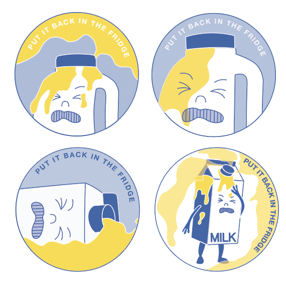
- People were generally very split between the top left and bottom right stickers, as to which was their favourite.
- People liked the colour scheme
- People liked the face and thought that it worked well with that concept.
- Somebody commented saying they liked the transparency of the smoke in the bottom right sticker and the way that it overplayed the bottle. I thought that this was interesting because it was something that I almost got rid of after my last feedback session (an unnecessary complexity).
What do I think works?
- I think that these stickers all work nicely together as a series - even though I only needed one I think that this is really nice. Creating work which works well in a series is something that I have struggled with in past projects (editorial brief) so I am really glad that I have begun to tackle this (even if by accident). - it is interesting to see how one very simple concept can be resolved in so many ways.
- I also loved working to a two colour specification. It was a really good way of forcing me to bring colour into my work without making me feel overwhelmed (and I think that it works well with the simple aesthetic of my imagery). - In future work, I think that it would be really beneficial to set myself my own colour restrictions.
What could I have done differently/ improved?
- Although fully exhausting this one idea seems to have worked to my advantage, I think that I maybe got settled on a single concept too early on. I definitely could have visually explored more concepts initially and perhaps even mocked up some more on illustrator.
- It also might have been nice to try making a sticker with no outline whatsoever - just flat plains of colour
- I could have also tried incorporating the text into the design more (rather than always having it around the outside of the sticker).
No comments:
Post a Comment